
Groundswell: Moving Action for Wind Power
REDESIGNING GROUNDSWELL'S ENERGY WEBPAGES TO INCREASE CONVERSION RATES FOR THEIR WIND PROGRAM

overview:
Groundswell is a 501(c)3 nonprofit that works to help communities switch their homes, apartments, and businesses to wind power. Based in the mid-Atlantic region, Groundswell is scaling up rapidly and needs to create a digital way to efficiently convert interest into leads for the program.
ROLE & DURATION
I collaborated with a Data & Tech Strategist and Energy Program Director to redevelop all of Groundswell's Energy Program landing pages. We conducted user research and usability tests to iterate multiple times and design the best solution.
Duration: 1 month
TOOLS & METHODS
- User Interviews + Customer Discovery
- Competitive/Comparative Analysis
- A/B Testing
- HTML/CSS
- Graphic Design
- Tools: Pen & Paper, Hubspot CRM
the challenge
"Switching to wind power seems really hard."
Ineffective Content.
The old website was outdated and disorganized. Content was not easily searchable or navigable, while the pages themselves
were quite bland and uninteresting. Nothing on the pages compelled users to take action.
Unwieldy Maintenance.
Groundswell created 30+ separate landing pages, with many of them only being used by <20 users. Unsustainable and unwieldy, it required a heavy lift to update and revise content. Therefore none of the content was up-to-date or relevant.
Below are examples of the old web pages: uninteresting, plain, dense.


solution overview
Make the reason for wind power clear & compelling.
In order to do so, we discovered that the following were our top goals to ship the product:
- Revamp the website's aesthetic and visual online identity and brand
- Provide compelling content that would move users to action through graphics and messaging
- Reorganize the program's information Architecture into a more intuitive and easily navigable flow
- Reduce the number of landing pages for more efficient maintenance by Groundswell staff
the approach
USER RESEARCH
"What compels users to action?"
In order to determine what type and what kind of content was compelling enough to move users to action, the team conducted weeks of Customer Discovery Interviews. Read more about the insights here.
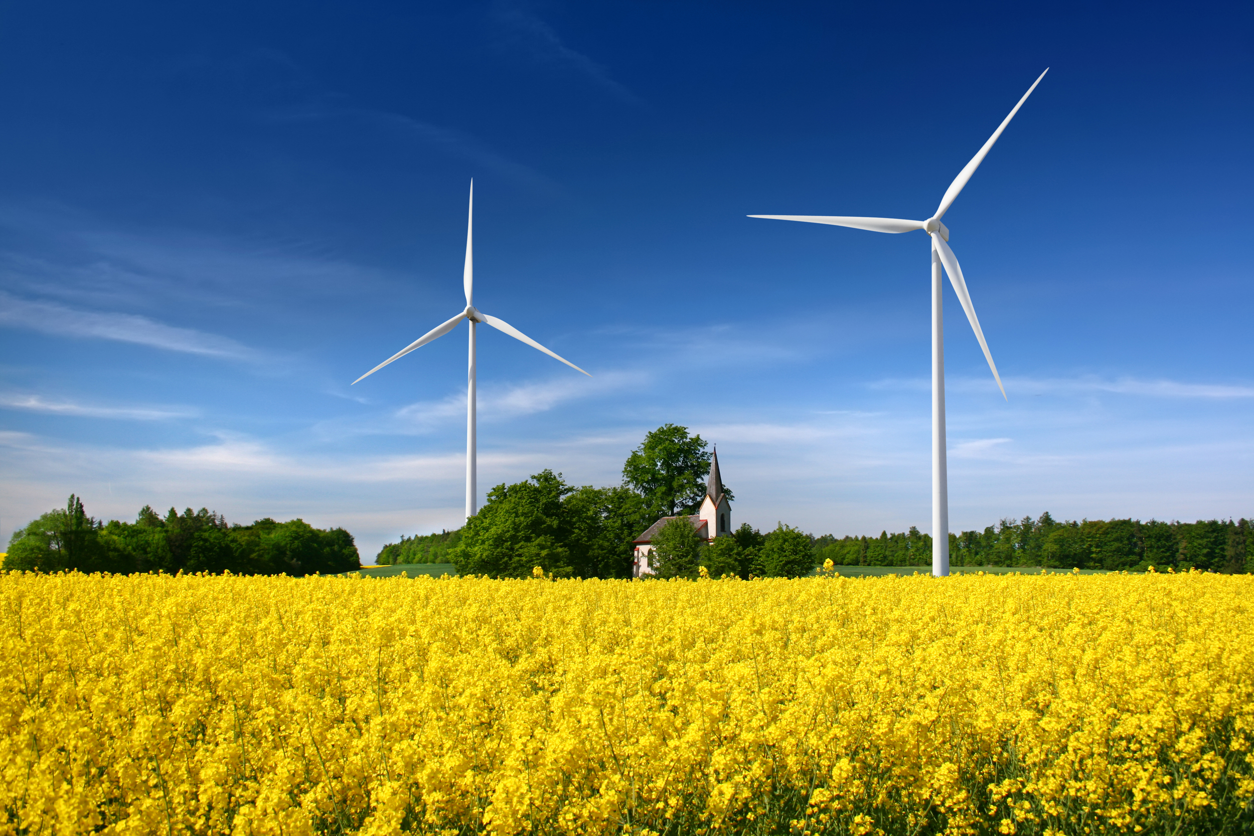
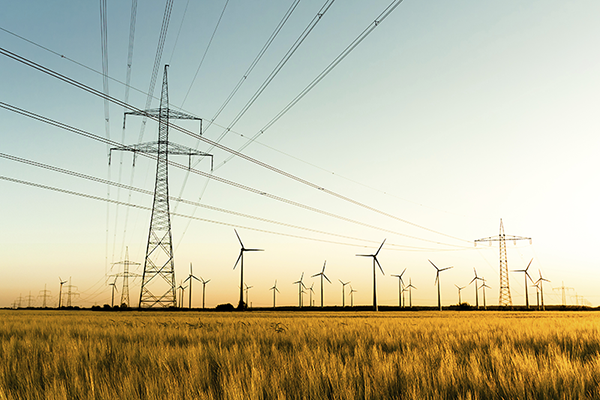
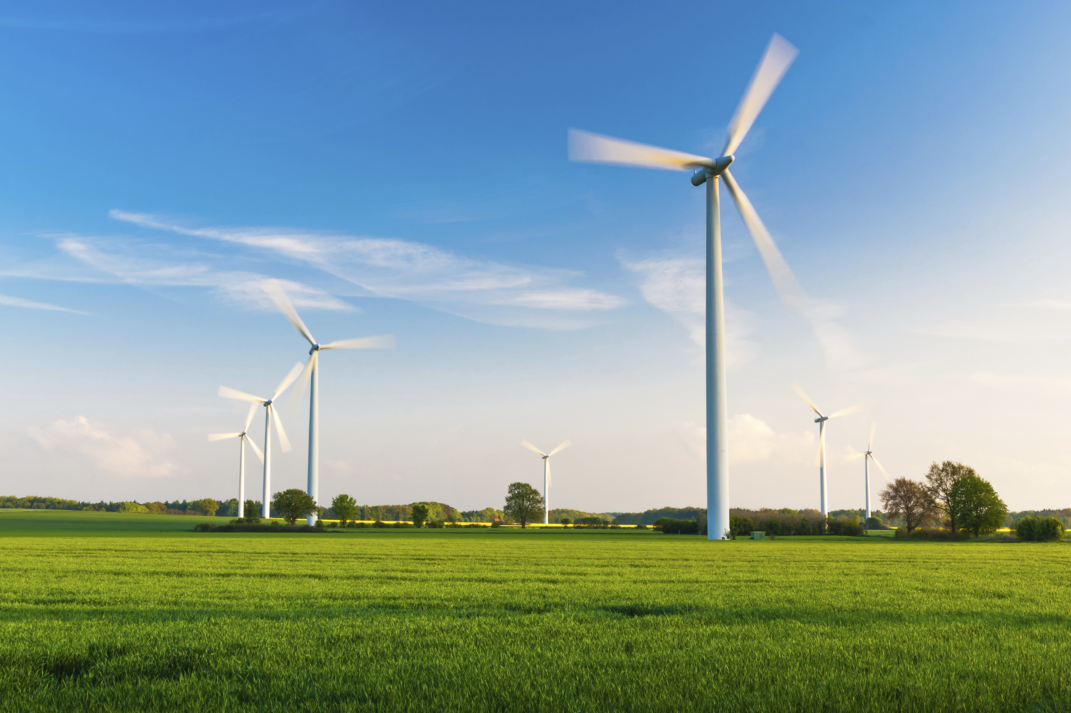
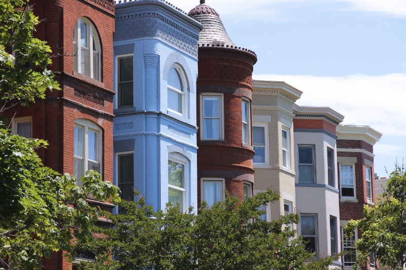
Following the interviews, we chose the following images and themes as possible content that could be compelling and could resonate with our users. The themes included wind power, electricity, community power, community, and residential architecture.


research & data
Follow the data, not your gut.
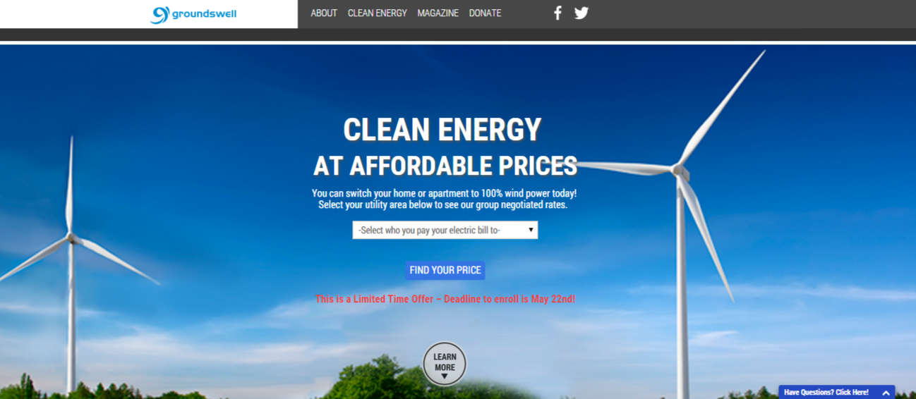
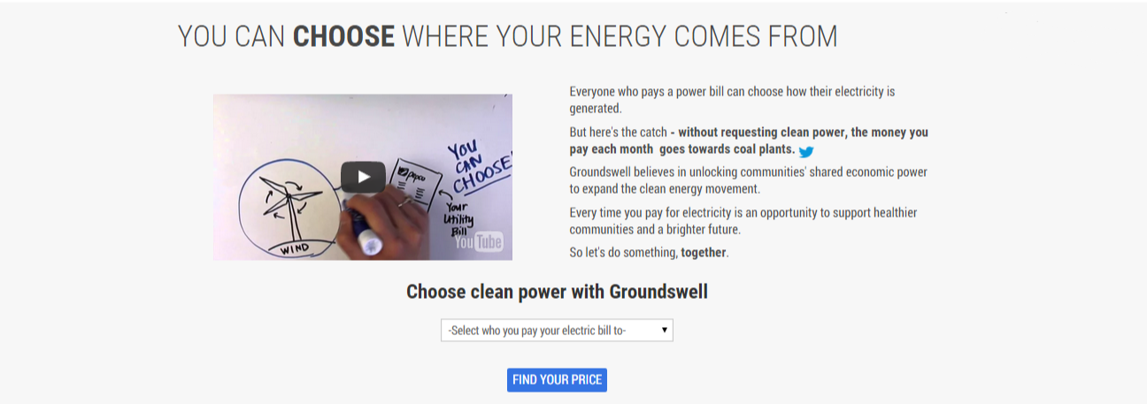
Following our User Research, I built out two identical pages with different banners and call to actions. Following the launch of our program, I ran a 2 week A/B test of which image seemed to compel users. After 2 weeks, we found that the BETA version of the our webpage had a higher conversion rate.
One important lesson I learned from this process was to never A/B test too many variables at once. Groundswell was severely pressed for time and wanted to test for multiple pages at once. For this reason, I also ran an A/B test on the second Energy Page at the same time. This proved to be a huge challenge as it may have skewed our results for the secondary A/B test. Moving forward, this simple, but extremely valuable lesson is one I will always implement in my future research. It is much more important to build in time to properly carry out separate A/B tests rather than try to do several experiments at once. Read more on my lessons learned here.

UsER Testing
More data. And then more. And more again.
In order to better understand the users, I employed several tools:
- Usability Testing:
I watched several users navigate our pages, noting the sequence and timing of their flow. Based off of this insight, I adjusted features on the page. - CrazyEgg Click Map (left):
This tool was used to visualize where most users clicked. As you can see, most were interested in "Learning More" as opposed to being ready to take action. - CrazyEgg Heat Map (far right):
The map showed that most users did not bother to scroll to the bottom of the page where we featured "Our Community", as well as links to the FAQ page. - Google Analytics (below):
I set up a Goal Flow in Google Analytics to track where users moved from page to page, as well as what page were places of either significant conversion or drop off.
All four of these tools gave me important points of data about user behavior on the pages and how to tailor the page to best fit their needs.


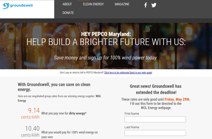
The new Energy Program pages:
Energy Homepage has clear call to actions.

As you can see, this page is significantly shortened, which was due to the data I saw in the CrazyEgg reports. In addition, I coded a drop-down menu to take users to their "Utility Specific" Page, which is where they would learn greater details about how Groundswell's wind program worked, the price they would pay, and how they can sign up.
LANDING PAGES FOR SPECIFIC UTILITIES
Functional information to help decision making.
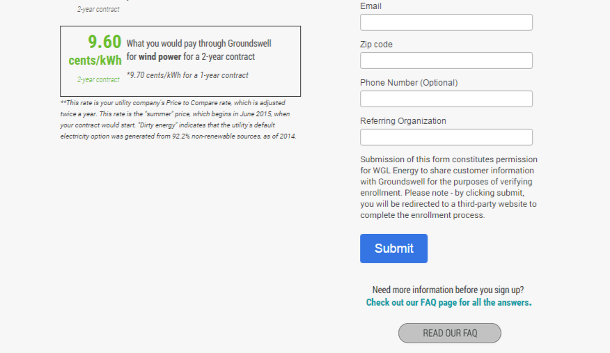
benefits of the new landing pages
The information they want, where they want it.
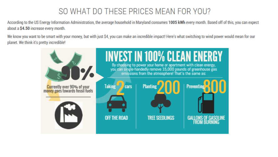
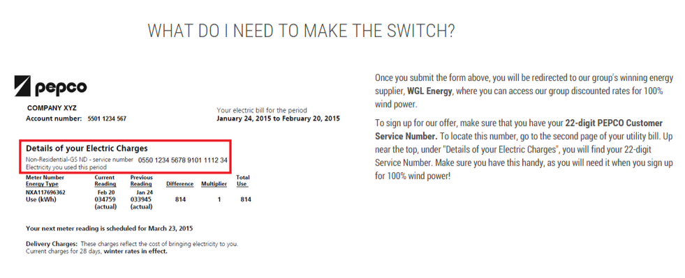
The new utility specific landing pages now provided important pieces of information that were previously large barriers of action for Groundswell's participants, including:
- The price participants would pay, as well as how that price compared to current market prices
- An infographic that put into context the environmental impact of switching to wind
- Instructions on what a participant will need in order to successfully sign up
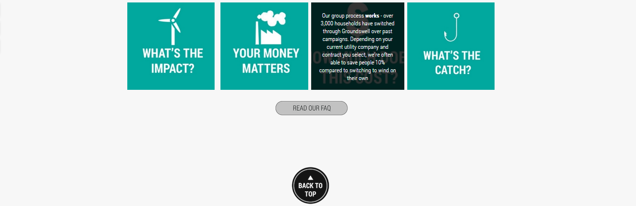
- Links throughout the page to our FAQ database
benefits of the new faq page
FAQs that are easy to scan, read, and digest.
Improvements to this page include:
- Interactive "accordion" format
- Questions grouped by subject
- Clear Call-to-Action on the page to sign up today


customer support widget
In addition to a new and improved FAQ page, a Customer Support Widget was also placed onto every Energy Page.
Users can click on the widget and search or read through
our FAQs. If they did not find what they were looking for,
they can immediately send a message to Groundswell's
Customer Support team through the widget. Additionally,
the widget allows users to rate how helpful each FAQ
entry is. This direct feedback is extremely beneficial for
the Customer Support team.
Lessons Learned
A good first step in the right direction, with room for improvement.
This website redesign was my first experience in the world of UX. As a someone without any previous exposure, I had to hit the ground running by learning and iterating along the way.
What I did well:
- Learned quickly - was able to adapt and iterate many times to find better templates/designs
- Built a completely new website for Groundswell's Energy program
- Gained complete control over the editing of Groundswell's webpages (previously it was in WordPress and under contract)
Use of participant feedback (from Customer Support) in improving web page components
What I can improve upon
- Follow best practices and conventions of UX design and A/B testing from the very beginning
- Create actionable hypotheses and drive enough traffic to our pages to test the hypotheses
- Building in continual incorporation of customer discovery to maintenance of webpages
- Building in time and resources to conduct statistically significant experiments
Read more on my reflections and lessons learned on this project here.