Reimagining life insurance enrollment with Big Financial Group*

OVERVIEW
My client, hereby referred to as Big Financial Group*, needed to redesign the enrollment process for their supplemental life insurance products.
*Client name has been removed due to non-disclosure.
ROLE & DURATION
I was on a team of five, including an account director, visual designer, and lead designer. My role was to conduct research, analyze data, create wireframes, ideate solutions, collaborate with the visual designer to finish designs, and present design solutions to client.
Duration: 14 weeks
TOOLS & METHODS
- Strategy and Concept Design
- Generative and Evaluative User Interviews
- Wireframe + Prototyping
- Usability Prototype testing
- Client Management
- Tools: Adobe Illustrator, Invision, Adobe Indesign, Keynote
the client problem
"How can we increase conversion during the life insurance enrollment process?"
-big financial group
One of the biggest challenges facing the Big Financial Group* was increasing conversion during the enrollment process for life insurance. They wanted to educate users on why supplemental life insurance was helpful and to make the process easier so more users would purchase their products with confidence.
the user problem
"I never really know how much life insurance I need. Do I actually need it? Or is it a waste of money?"
-users
One of the biggest challenges users faced was understanding the value of supplemental life insurance, determining the correct amount of life insurance to purchase, understanding how insurance elections impacted their paycheck, and how to actually enroll for the products. In the current state of the website, all of these tasks proved to be quite complicated and difficult to navigate.
the engagement approach

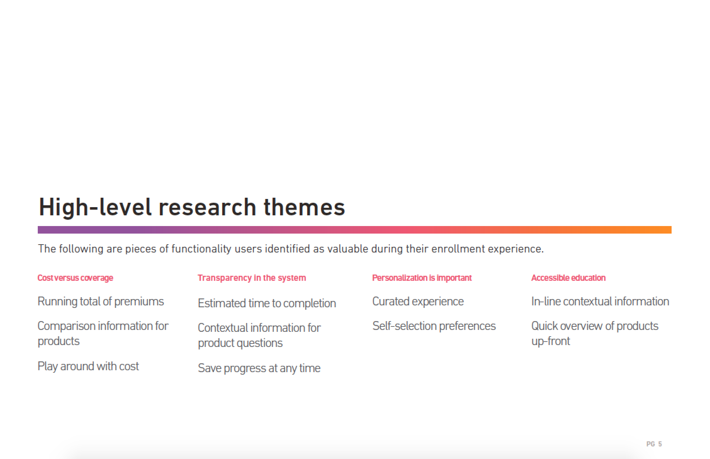
the high level research themes
Why do this? How much will it cost?
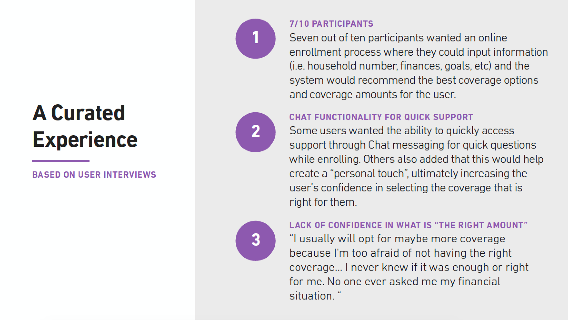
Over the course of the engagement, the team interviewed 20 users through both generative and evaluative user interviews and tests. We asked them questions about their experiences with the current website, as well as asked them to quantify their experiences with a System Usability Scale Questionnaire (SUS). Taking insights from the data, we redesigned the enrollment process and retested the designs through a prototype in Invision. Once again, we asked users to quantify their experience with the SUS score. The following are the main 3 themes uncovered through the 20 interviews conducted.
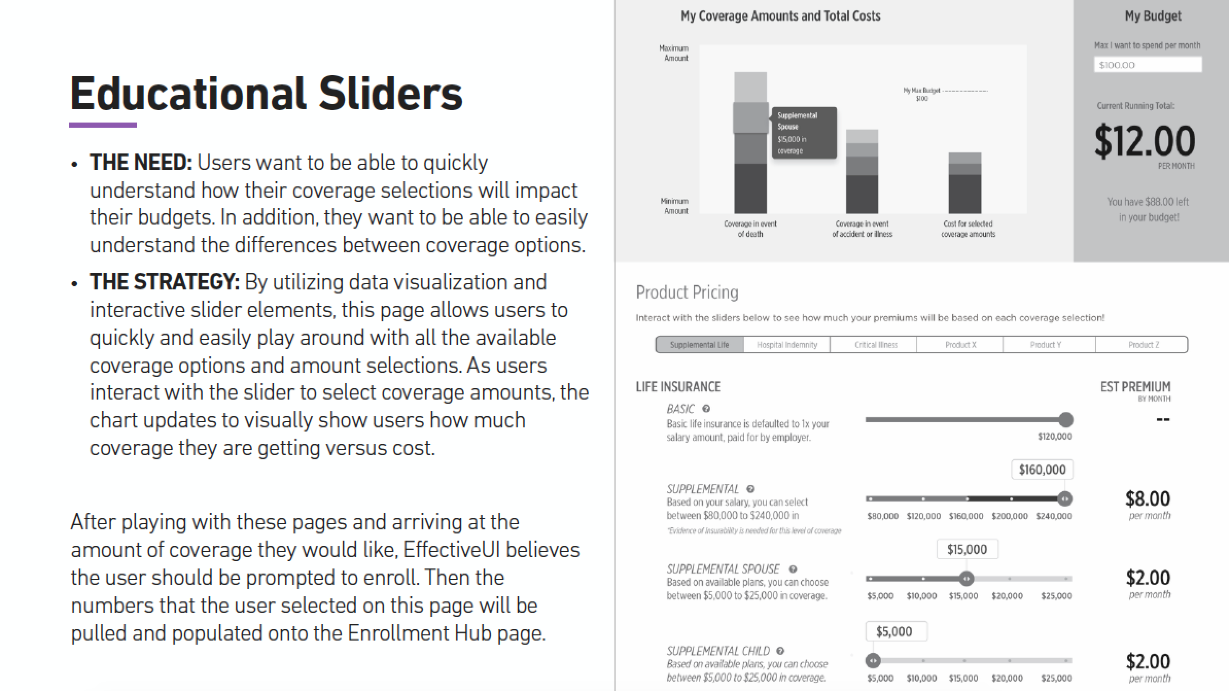
cost versus coverage
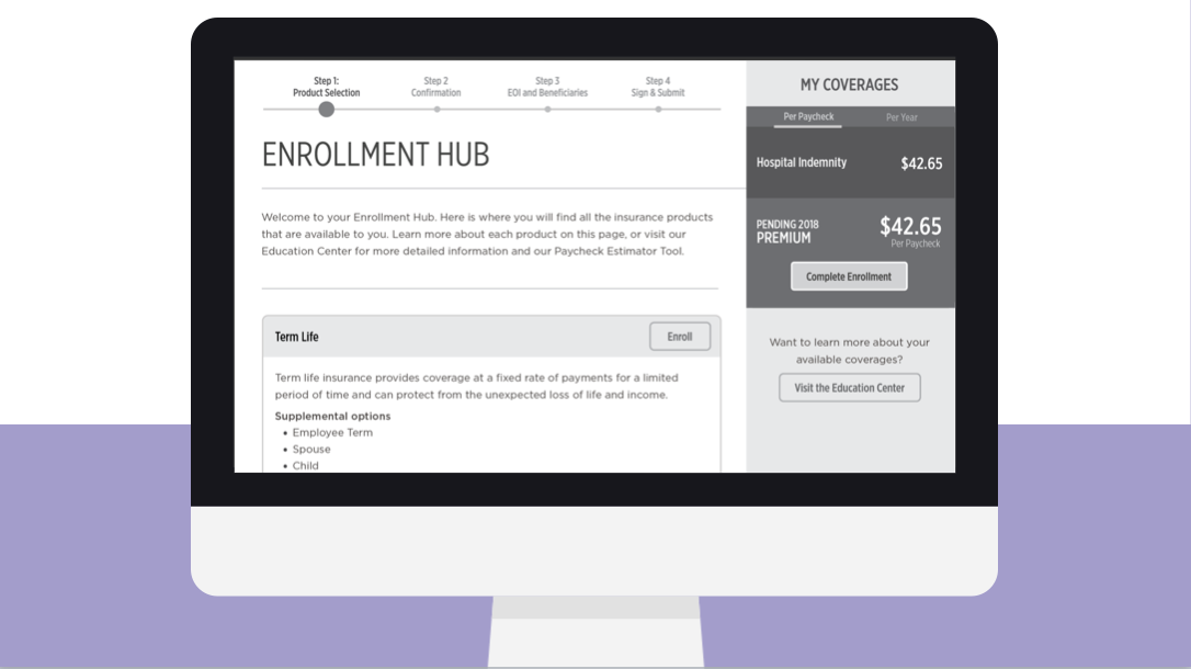
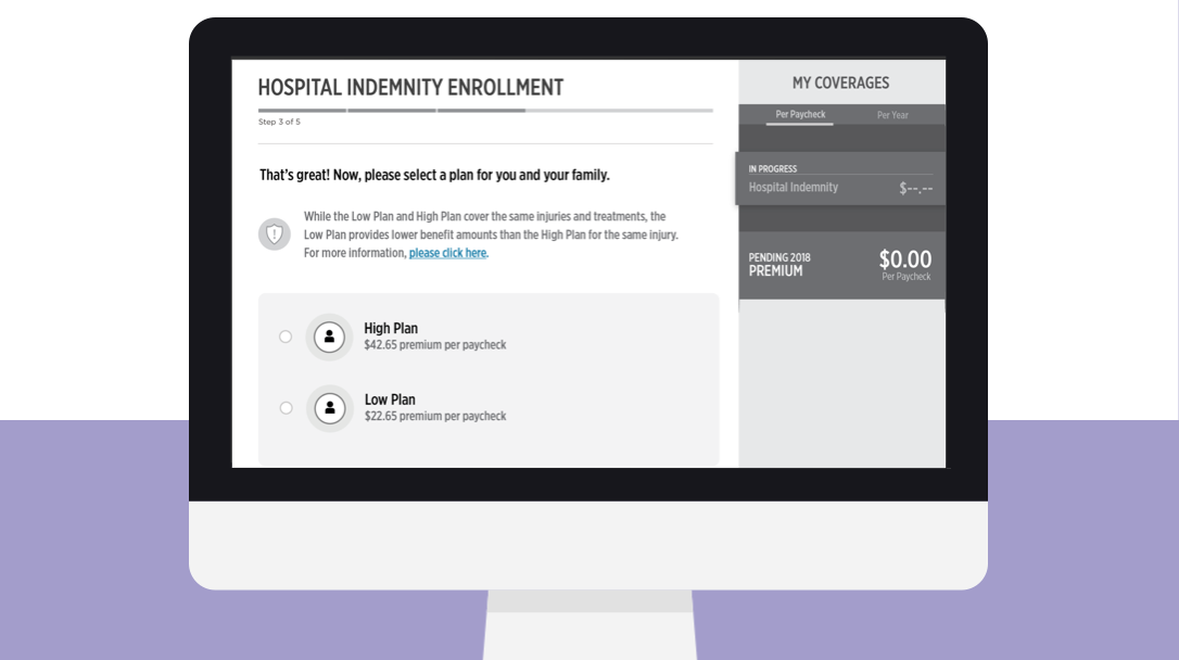
Users needed to better understand each product’s cost versus the coverage. In the current site, it was not easy for the user to directly compare and understand:
(a) How much coverage elections impacted the user’s paycheck
(b) How much additional coverage users get for larger amount selections
These pain points were especially important for participants who self-identified as being “cost conscious” while enrolling for life insurance. For that reason, the redesigned concept readily shows the cost vs. coverage to address user pain points.
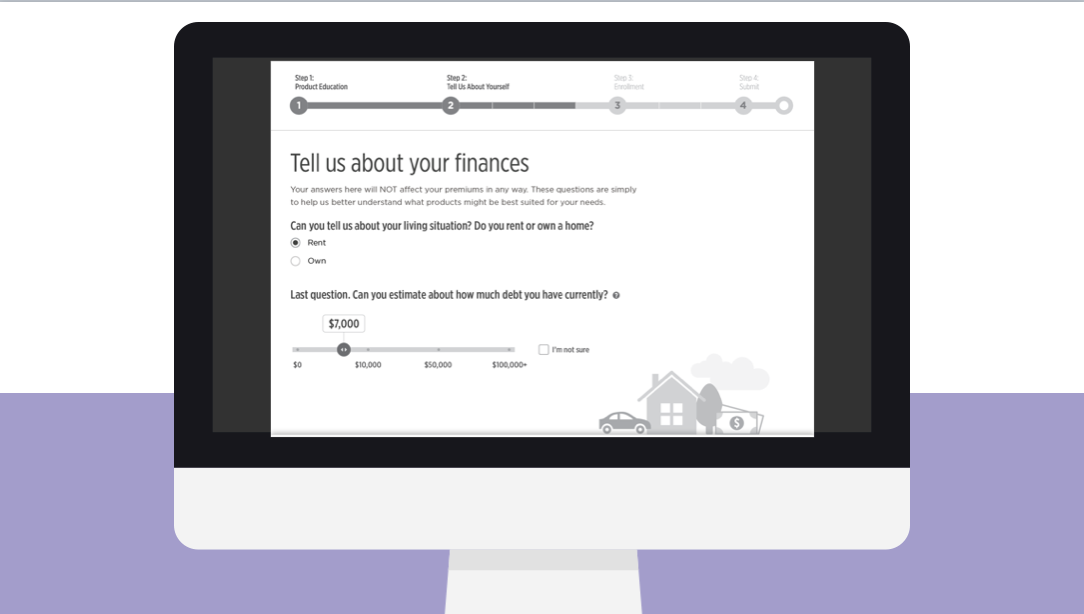
transparency in the system
Additionally, our user interviews uncovered a need for transparency in the system. There are several instances where users voiced feeling uncomfortable, distrusting or confused when certain questions were being asked. Additionally, users want increased transparency regarding the actual system, including the time to completion, progress bars and ability to return at a later point. For that reason, the redesigned concept clearly communicates with the users, especially at points of high confusion.
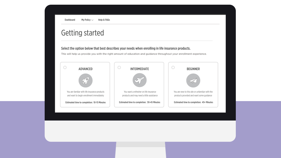
personalization is important
Through initial user interviews, it was discovered that users wanted to input information (i.e. household number, finances, goals, etc) and have the system recommend the best coverage options and coverage amounts for the user. All participants in the concept tests also indicated that they would answer questions up-front if that inputted data would enhance their experience later with customized information and recommendations. .
accessible education
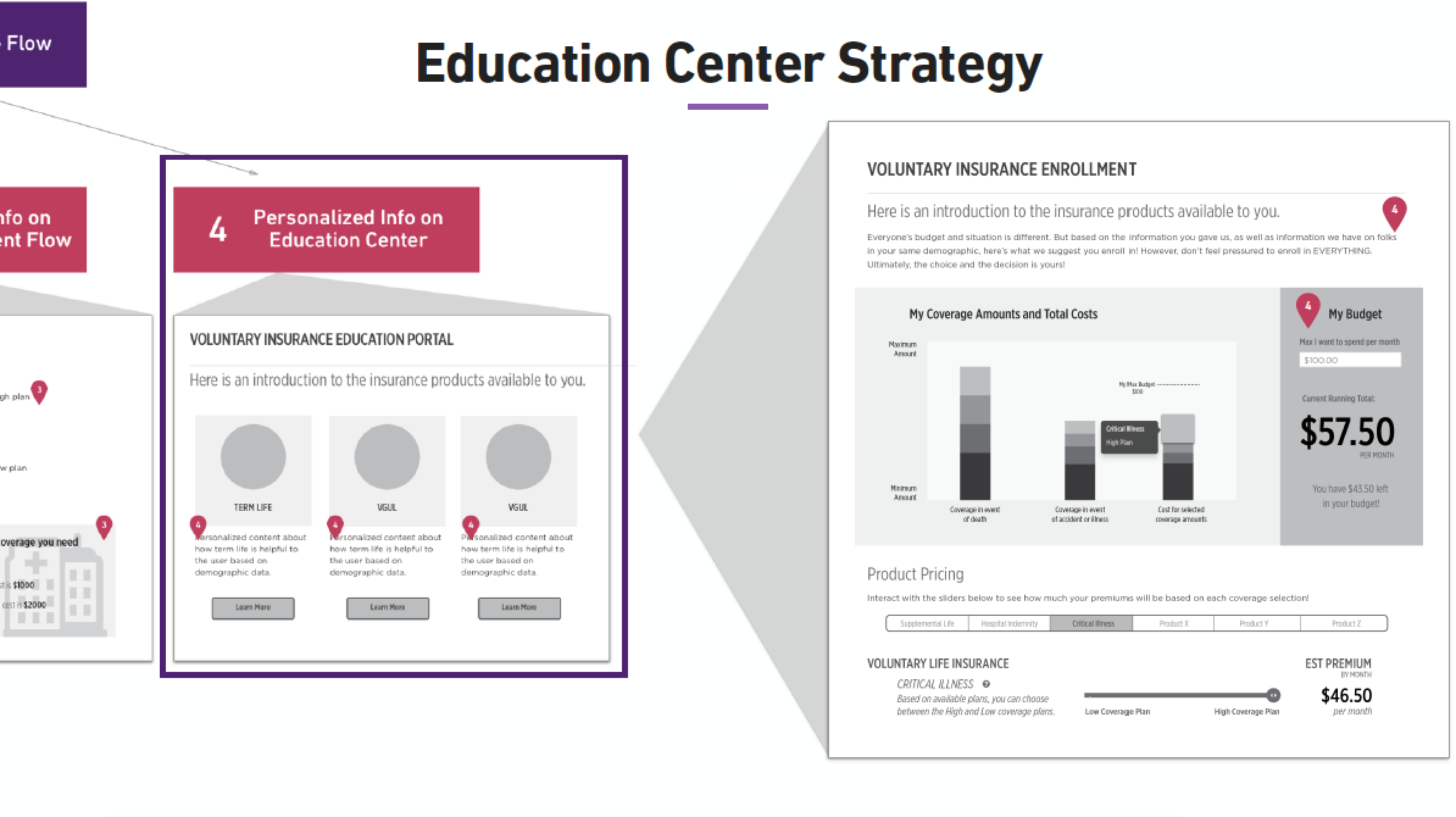
Finally, a theme Effective discovered through user interviews and concept testing was the need for accessible education throughout all steps of the enrollment process. Users voiced their concerns about enrolling for products that they did not feel comfortable or knowledgeable about.
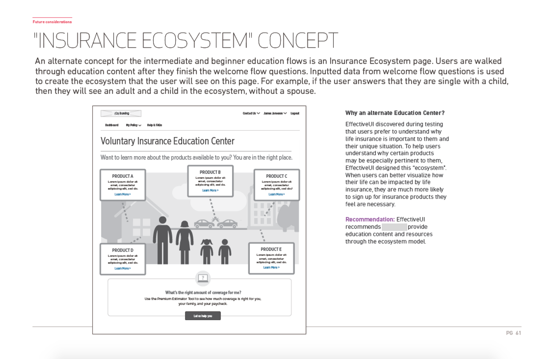
the solution overview
Creating a educational, personalized, and reassuring enrollment process for users of all knowledge levels.
After extensive research, it was clear that the current website did not meet the user's needs. As a result, many users had their own external workarounds, such as an Excel document, that either they created or received from a coworker. The new site would allow users to both view high level overviews of their production, while also enabling them to dig deeper into the data if necessary.
From the research, I created the strategy behind WHAT the "Guided Experience" would look like and WHY this was a huge win for both the business and the user.

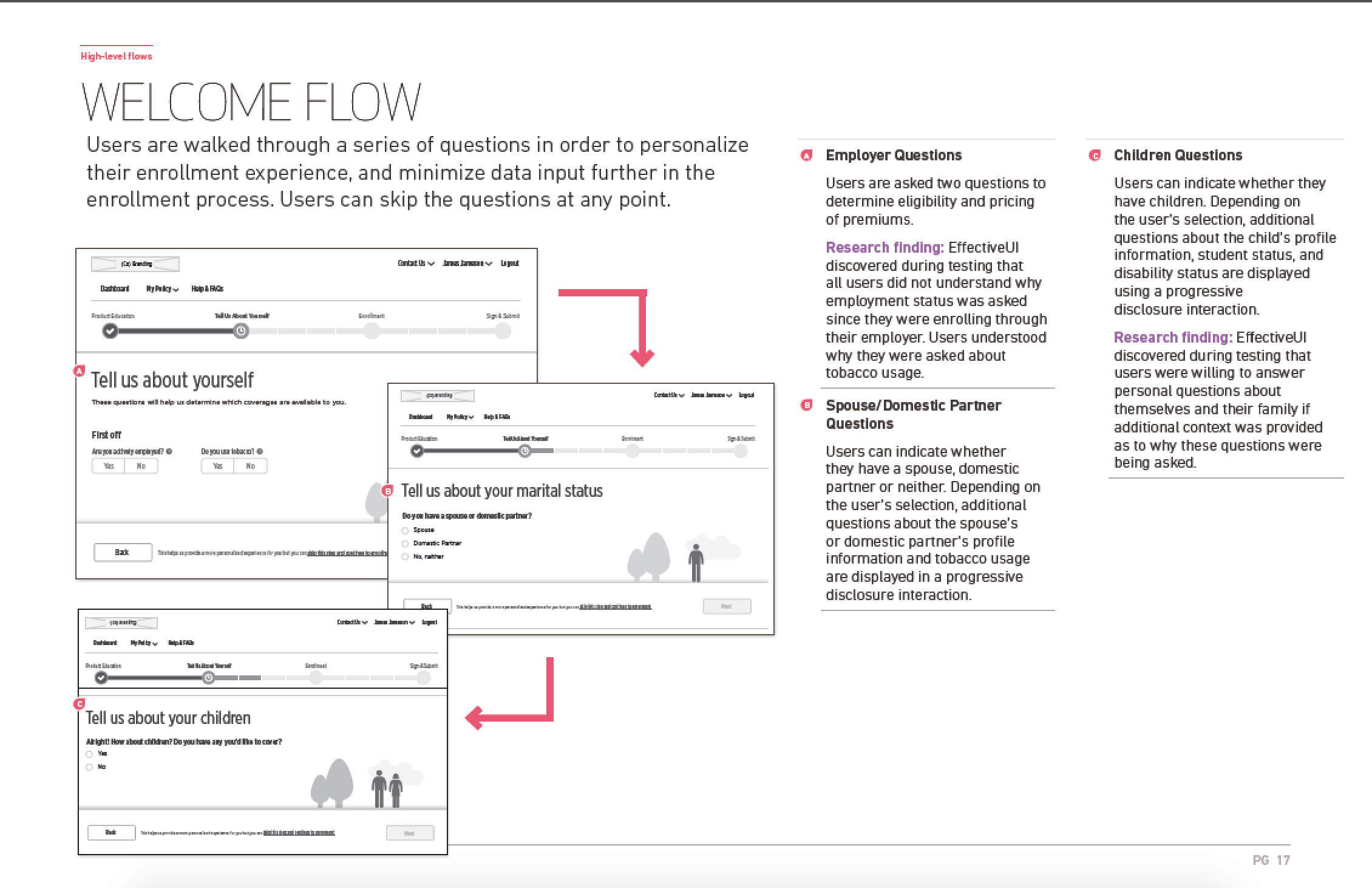
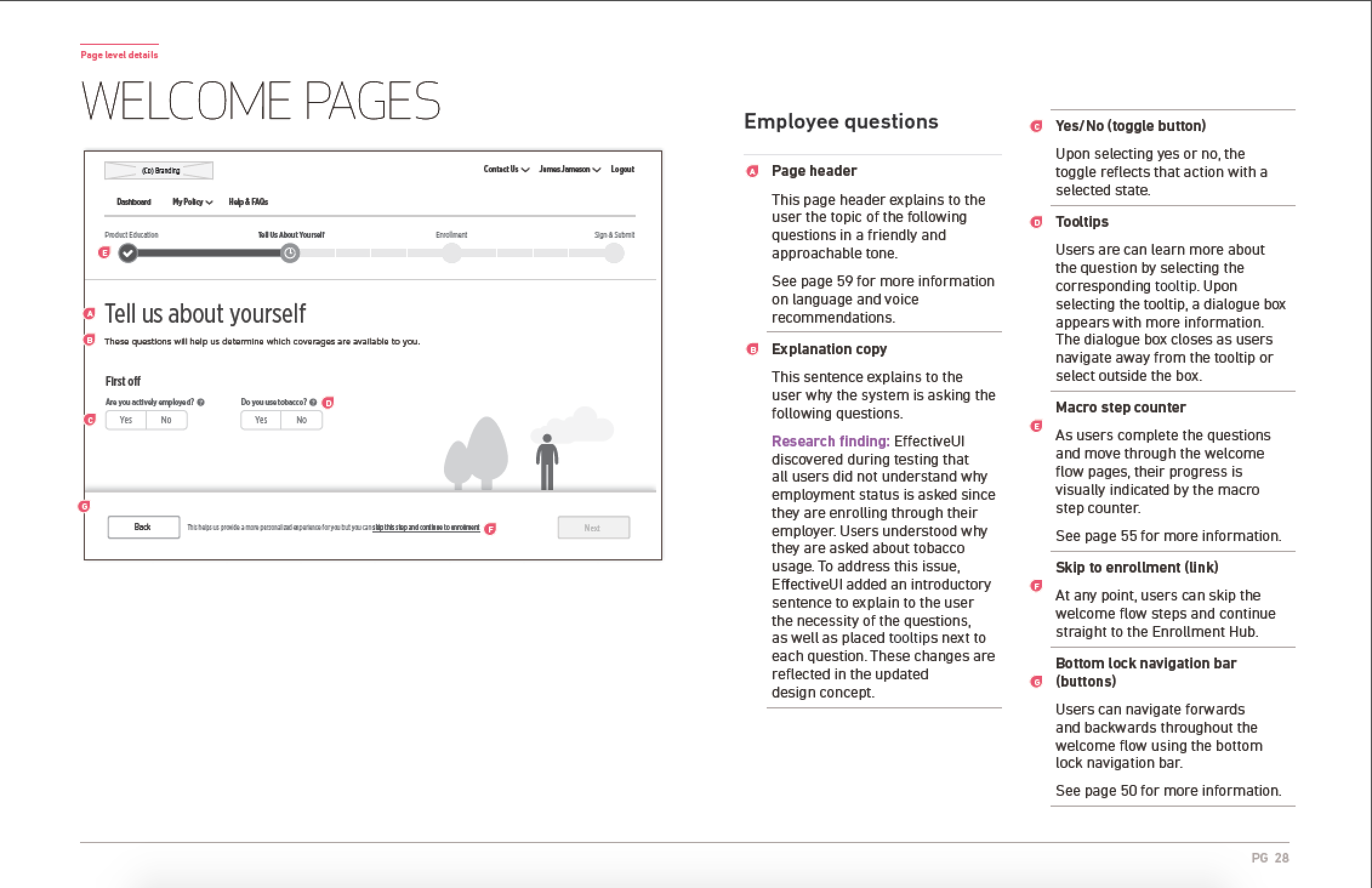
The defined system flow:

This is a visualization of the high-level flow that a user could take throughout the enrollment process. I used data from the research to determine the final flow of the pages, and worked with a visual designer to create this final visual output.
deliverables
A guided experience to empower individuals to make their own choices.
working prototype in invision
In order to empower the clients to build and implement the design solutions, we passed along all design documents and development specifications. In addition, we provided the fully functional working Invision prototype so that developers would be able to understand the greater user flow through all webpages.
*Due to non-disclosure, the prototype cannot be shared
comprehensive design annotation deck
To clearly communicate our research, design solutions, and future considerations to the client, I wrote and created the final deliverable of design annotations to the client. This document clearly outlines each element of the design, UI interactions, major user flows throughout enrollment, and important areas and opportunities for future testing and design.