Big Financial Group*: Web Redesign

OVERVIEW
My client, hereby referred to as Big Financial Group*, needed to redesign an internal system to empower their financial advisors and financial firm leaders to track their performance and revenue throughout the year.
*Client name has been removed due to non-disclosure.
ROLE & DURATION
I was on a team of five, including an account director, visual designer, and lead designer. My role was to conduct research, analyze data, create wireframes, ideate solutions, collaborate with the visual designer to finish designs, and present design solutions to client.
Duration: 14 weeks
TOOLS & METHODS
- Design Strategy and Concept Design
- Generative and Evaluative User Interviews
- Wireframe + Prototyping
- Usability Prototype testing
- Client Management
- Tools: Adobe Illustrator, Invision, Adobe Indesign, Keynote
the problem
"There's a ton of great data on [the site]. It's just not served up in the right way."
-financial advisors + firm leaders
One of the biggest challenges facing the financial advisors and firm leaders working for Big Financial Group is that the website they used to track their production, revenue, goals, and progress towards goals was difficult to use. While the site contained the information they needed to do their jobs, oftentimes finding and using that data proved to be a very difficult task.
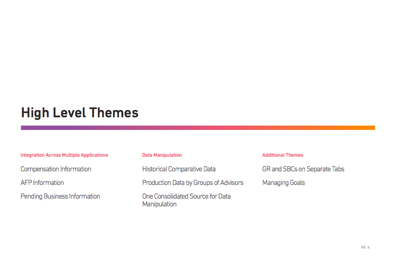
the high level research themes
Integration, data manipulation, and progress to goals.
Within the first two months, the team interviewed a group of 10 financial advisors and firm leaders. We asked them questions about their experiences with the current website, as well as asked them to quantify their experiences with a System Usability Scale Questionnaire (SUS). Taking insights from the data, we redesigned the application and retested these 10 individuals with a prototype in Invision. Once again, we asked users to quantify their experience with the SUS score. The following are the main 3 themes uncovered through the 20 interviews conducted.
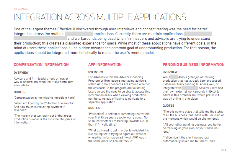
integration across multiple applications
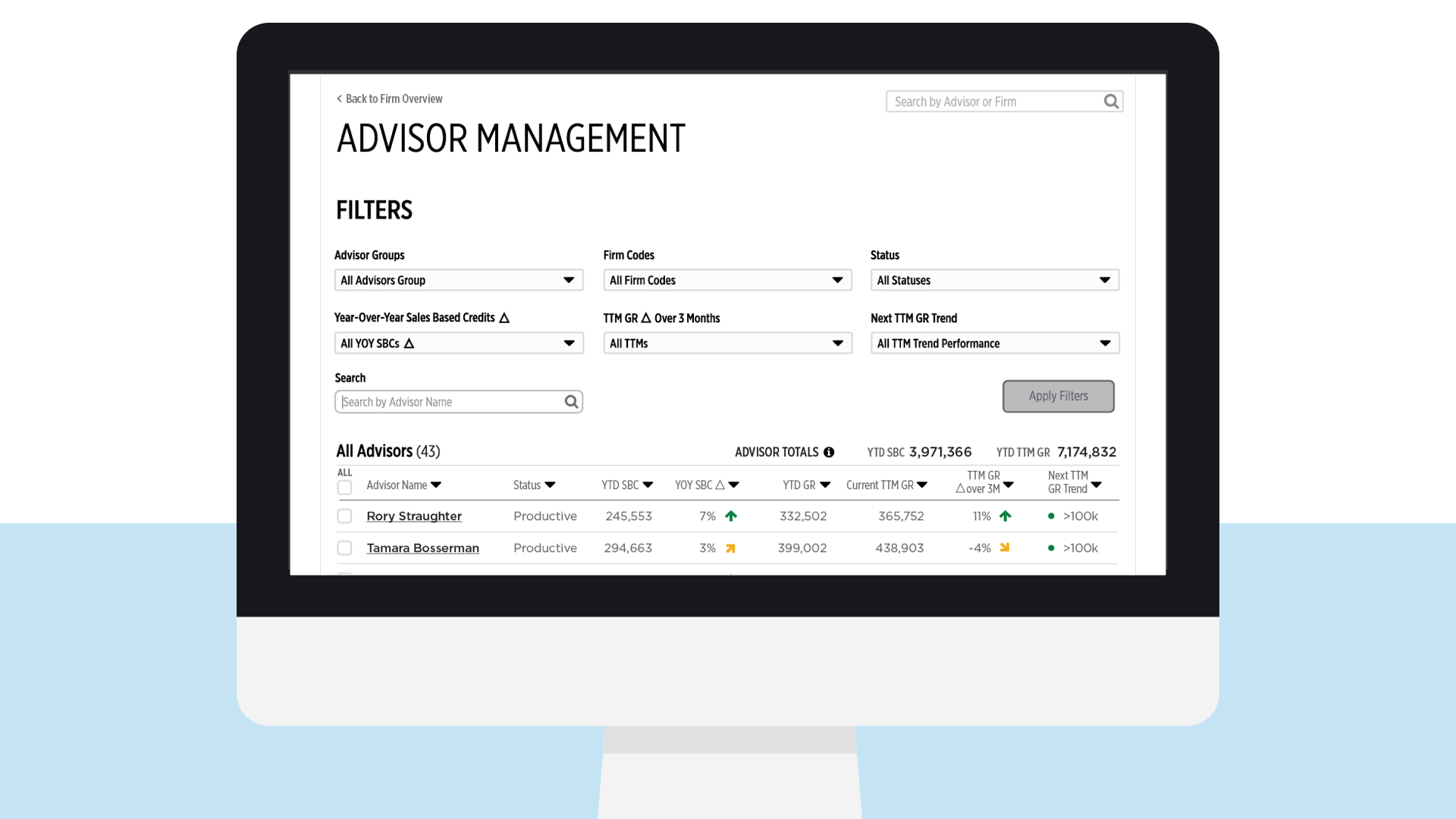
Through the interviews, our team realized that there were multiple applications and external workarounds being used when firm leaders and financial advisors are trying to understand their production; this creates a disjointed experience for users. While most of these applications have different goals, in the mind of users these applications all help drive towards the common goal of understanding production. For that reason, the applications should be integrated more holistically to match the user's mental model.
data manipulation
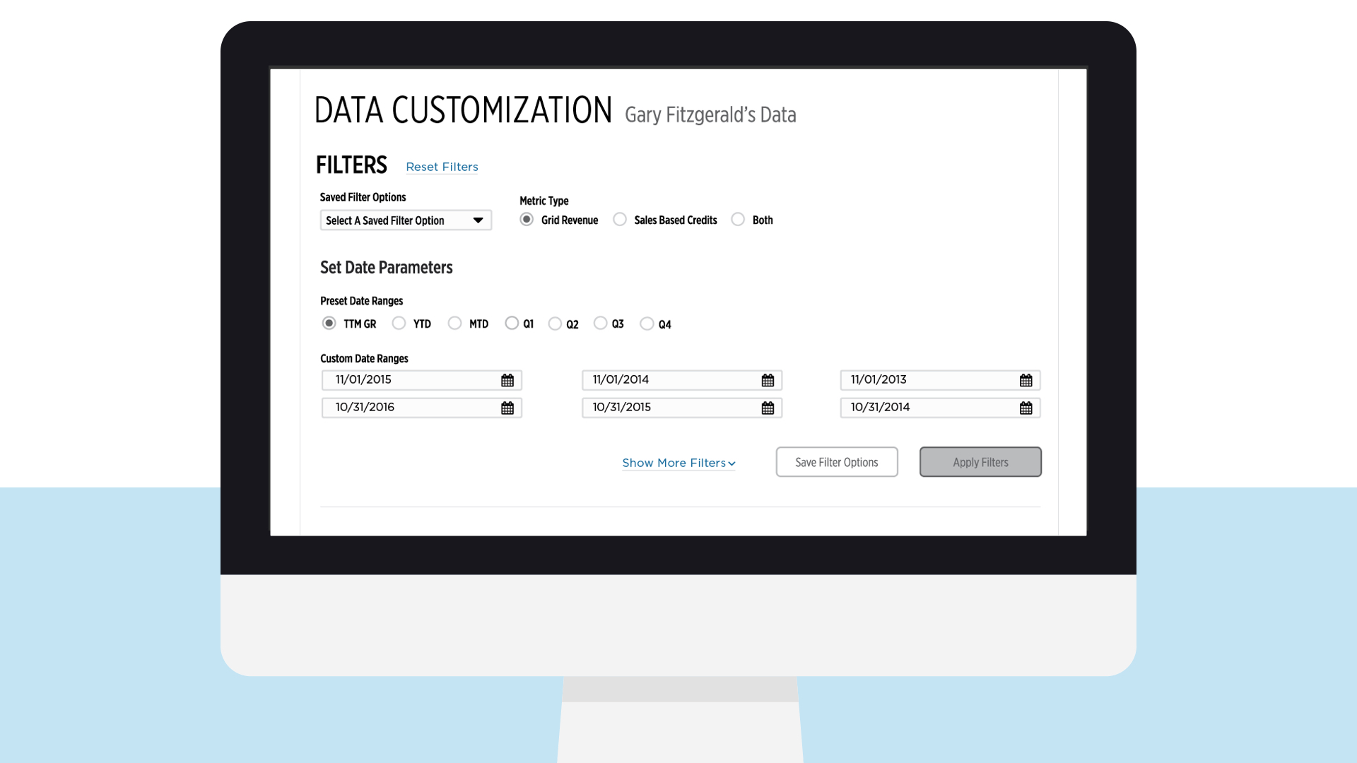
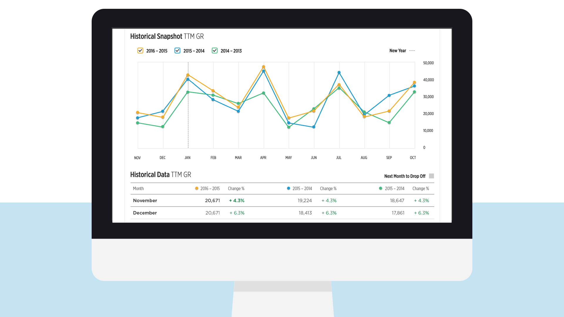
Additionally, our user interviews uncovered a need for data manipulation. Users need the ability to filter, sort, collate, and group production data by time frame, advisors, or firm. Currently, users do this data manipulation in external Excel sheets. Users have to pull data from several different sources to create these manual data manipulation workarounds. This process is time consuming and hard to keep accurate. For these reasons, the new website needed to provide this functionality in one page within the application.
Managing goals
Through user interviews and concept testing, it was discovered that users wanted to have the ability to manually input and adjust their own monthly and yearly goals. The goals put forth from Big Financial Group* were not meaningful to many users.
the solution overview
Creating a well integrated tool where users can find and manipulate available data to meet their needs.
After extensive research, it was clear that the current website did not meet the user's needs. As a result, many users had their own external workarounds, such as an Excel document, that either they created or received from a coworker. The new site would allow users to both view high level overviews of their production, while also enabling them to dig deeper into the data if necessary.
deliverables
Comprehensive, Holistic, Impactful.
working prototype in invision
In order to empower the clients to build and implement the design solutions, we passed along all design documents and development specifications. In addition, we provided the fully functional working Invision prototype so that developers would be able to understand the greater user flow through all webpages.
*Due to non-disclosure, the prototype cannot be shared
comprehensive design annotation deck
To clearly communicate our research, design solutions, and future considerations to the client, I wrote and created the final deliverable of design annotations to the client. This document clearly outlines each element of the design, UI interactions, and important areas and opportunities for future testing and design.