
Helping Aetna join users on their personal health care journey.

Source: https://www.healthline.com/health/5-minute-daily-workout-routines-really-beneficial
OVERVIEW
Aetna is a health insurance company that wants to join the user in their own health journey. One strategy is through creating an online app and web experience that is both personalized and useful, without crossing that threshold of being intrusive or creepy (coming from a large health insurance organization).
ROLE & DURATION
As a Senior Product Designer and Team Lead, I lead a team of UX/UI designers to work across a host of features across the product, including: health and wellness coaching, health records, device integration, messaging, personalization, recommendation engines, rewards and incentives.
This case study will cover the personalization and recommendation engines we've been working on!
TOOLS & METHODS
Strategy and Concept Design
Design studios/workshops
Generative and Evaluative User Interviews
Product strategy and requirements definition
UX design (wireframes, user flows, prototypes)
Tools: Sketch, Omnigraffle
the problem
"How can we best serve our members with personalized recommendations, both in the health space and the financial space?"
One of the biggest challenges our team faced was being able to thoughtfully create a new feature while also vetting the problem space in the first place. This is neither an area Aetna has historically operated, nor a place where users might expect their health insurance company to be in.
Our first data model was: Members who have NOT seen a Primary Care Physician in the last two years are about 5 times more likely to go to the ER for avoidable visit which is extremely costly both for the member, and for Aetna.
the approach
competitive analysis
I took a look at what other companies were doing, both in and outside the health care industry. How were companies incentivizing their members to take certain actions to improve X or Y? How were companies reaching their users? How were companies asking users to even buy into the feature in the first place?
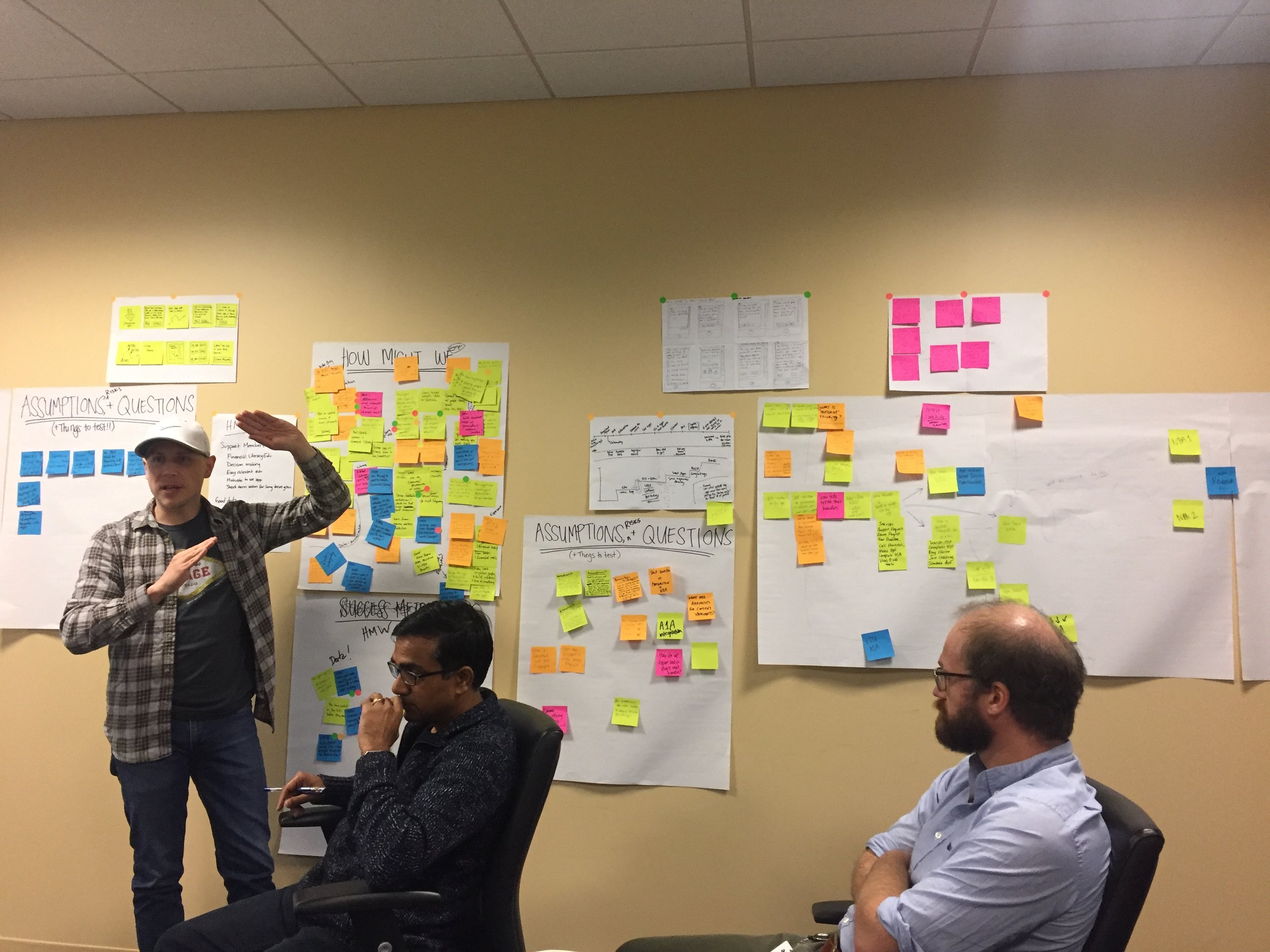
cross-discipline workshop
I planned and led two cross-discipline workshops between design, research, product, engineers, data scientists, and content strategists. In these workshops we did many activities, including:
Understand the problem space: competitive analysis, existing user research, user flows, user journey maps, personas, data analytics, data models and frameworks
Create a framework for behavior change: define key metrics and KPIs, create robust workflow with business rules, create general behavior change matrixes, ID outstanding gaps in matrix for followup research
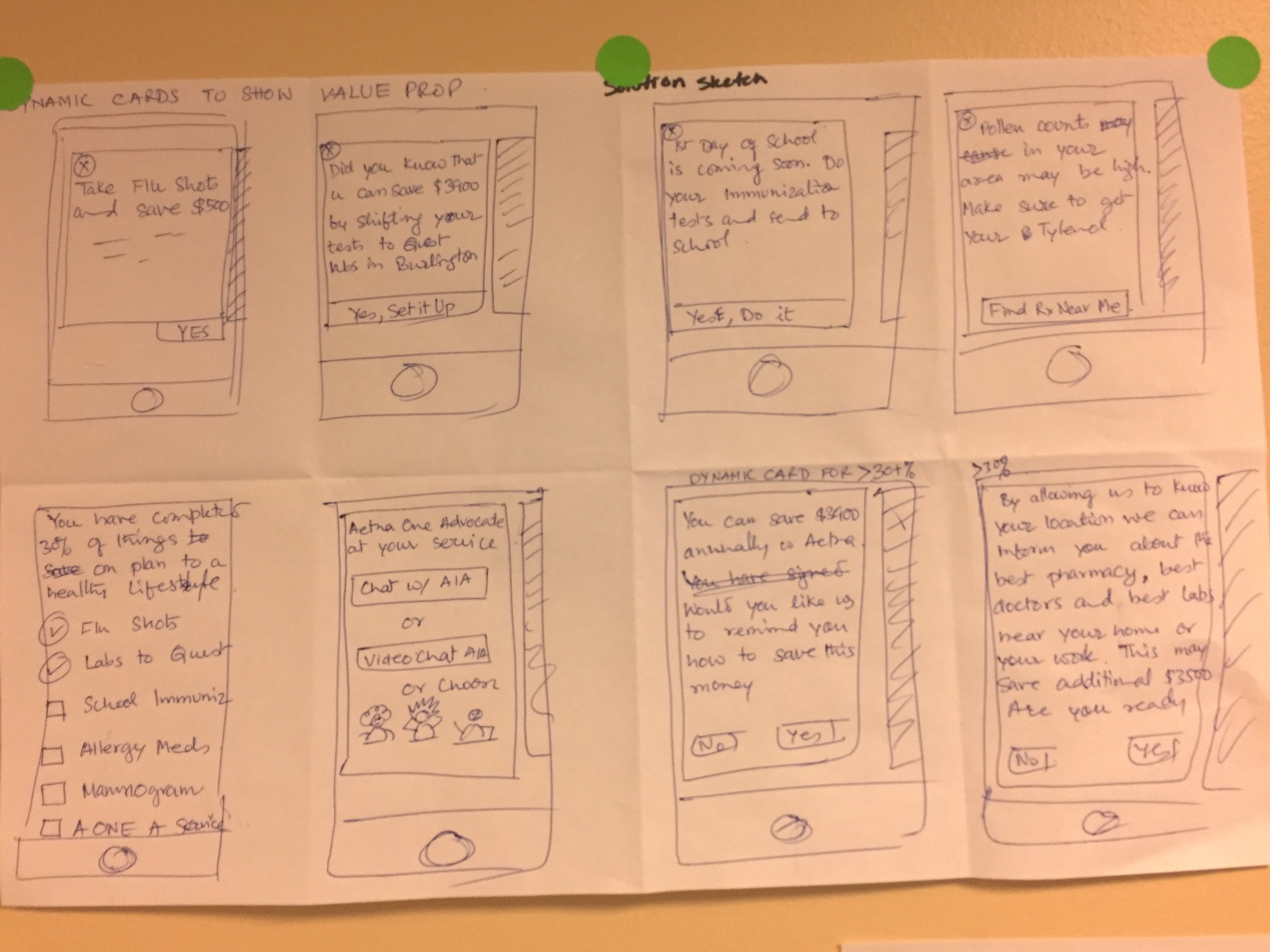
Ideate and create: ID/dot vote most pressing UX/UI/content problems, crazy 8 sketching, solution sketching, group share outs and ideation sessions
Prioritize and set a clear tactical direction: coordinate between multiple disciplines to create a completely net new feature
technical requirements and constraints
Working across Aetna's large technical departments, I vetted my design solutions with front end teams, server teams, architects, and data scientists. Being able to scale back, iterate, and adapt the designs based on the enterprise's current tech limitations and product roadmap for critical in the success of this work.
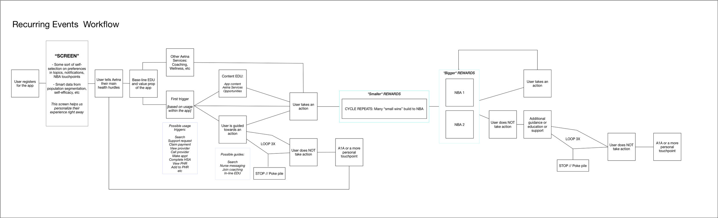
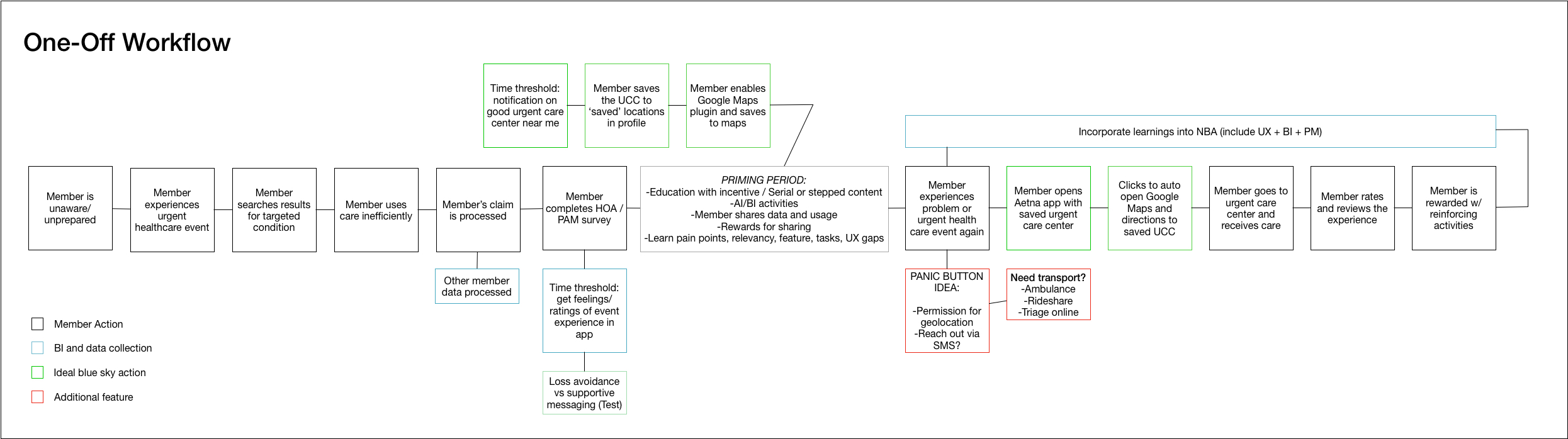
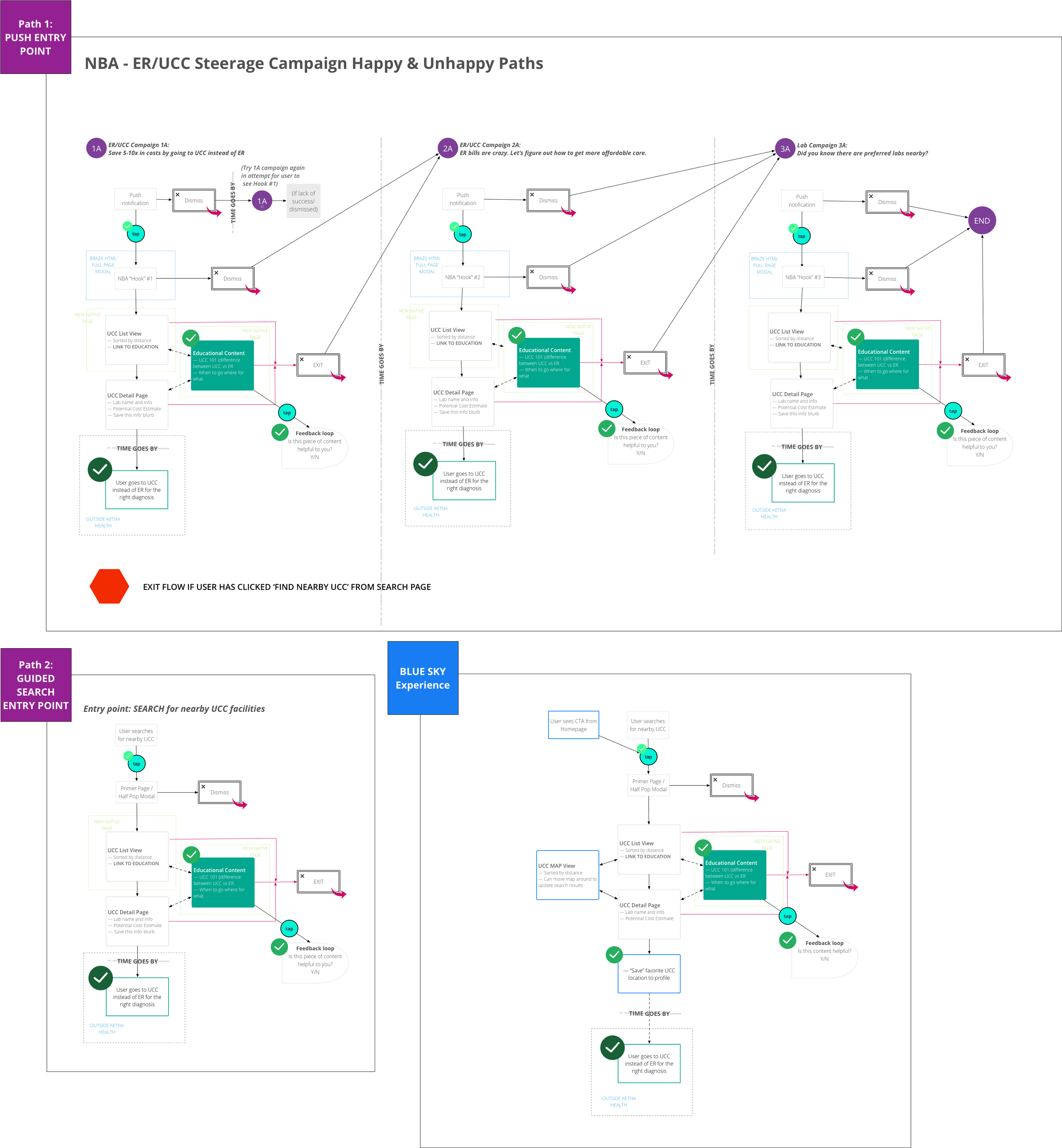
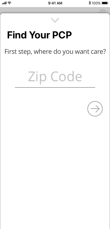
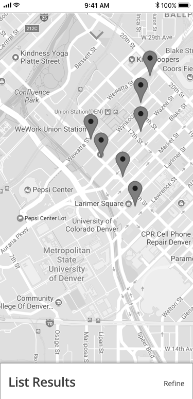
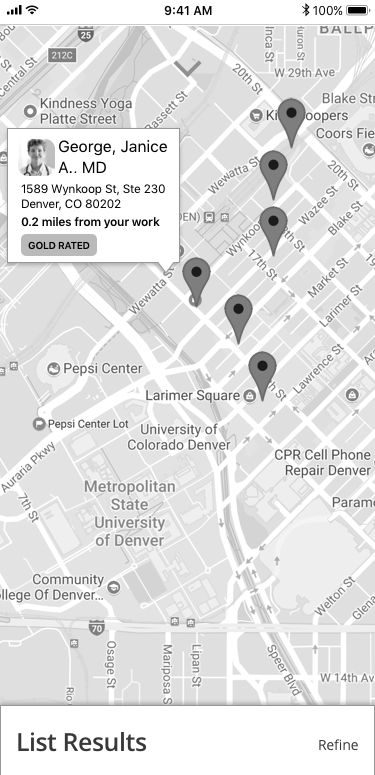
user flows
After conducting the initial workshops, setting the strategic vision, understanding the technical requirements and constraints, and scaling the project back to an MVP that could be built iteratively within our agile framework, I set out to map out the user flows for our many cohorts for our pilot recommendation.
initial wireframes + prototyping
After the user flows were finished, I created low- and medium-fidelity wireframes to illustrate the main user flows. I then put together a prototype to test with users in a moderated usability test. I helped our UX Researchers to create the moderator's guide, but I myself did not conduct the interviews.
ux/ui collaboration
After we received the results from our testing, I worked with product to define requirements and acceptance criteria for UI designers and engineers to pick up in their sprints. Working with the UI designers, we translated my medium-fidelity wireframes into high-fidelity screens and specs for both Android and iOS engineers.
final specs for engineering
As the team lead, I facilitated the kickoff meetings between product, design, and engineering for the handoff to start development.
insights throughout the process
Several of the following factors influenced many of our designs and ideations:
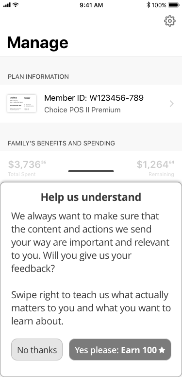
1. personal data and the 'creep-factor'
By using a user's personal health data, claims history, and self-reported data, Aetna can create predictive data models to create a list of recommendations. However, the important line to walk here was being able to clearly communicate the value proposition of such features to the user, while maintaining transparency and managing expectations. If we didn't do this well, users described feeling the "creep factor" in that Aetna shouldn't be monitoring their health/actions like that.
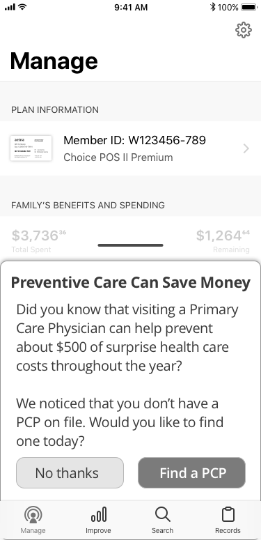
2. reaching users at the right time, with the right message
Part of the strategy we outlined was utilizing both push and in-app messaging to reach the user. However, being able to predict reaching the user at the right time with the right message is very difficult without both the proper data and data collection methods.
3. balancing overwhelming business objectives with user needs
Many of the data models and recommendations created by the data analytics team greatly weighted business objectives over value to the user. Part of my job was to identify the sweet spot (if it existed) in which the value we created for the user was significant enough to justify messaging them, regardless of the overwhelming business objectives.
4. 'blue sky' versus mvp
Aetna's digital products are very new (launched 1/1/2018) so there are many technical constraints and basic functionalities that still need to be built out. In leading the design workshops and studios, it was helpful to see the vision and 'blue sky' solution. But it was also my job to effectively scale back that solution to an MVP that created enough value to the user.
5. future proofing designs to gather data for machine learning
Working closely with Aetna's senior data scientists who specialize in AI and Machine Learning, I mapped out parts in the app experience where we could and would collect feedback from the user. By utilizing a number of different feedback mechanisms, we could learn more about what users preferred and found useful, and use that data to fine tune Aetna's machine learning algorithms and models.
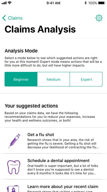
the solution overview
Identifying the north star for subsequent iterations while scaling back for the MVP.

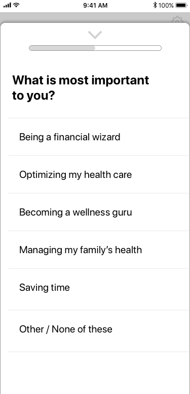
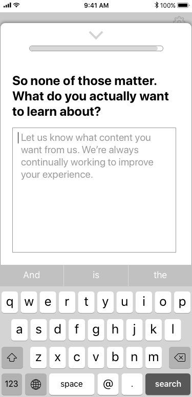
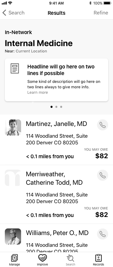
Example user flows
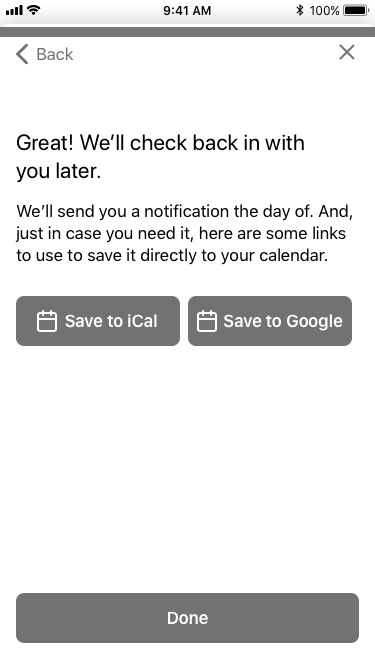
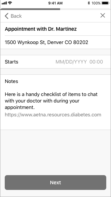
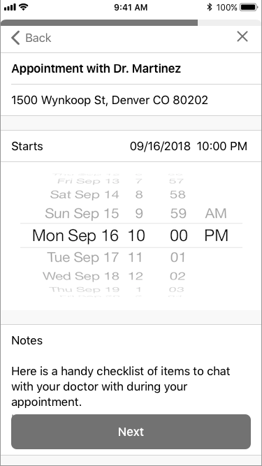
After the workshops, I was tasked with mapping out the user flows for each of our educational campaigns and personalized recommendations.
Through both push notifications, in-app messages, and entry points within the application, we wanted to provide the user with a holistic experience in accessing our personalized recommendations for them.
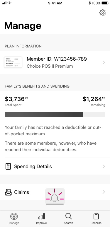
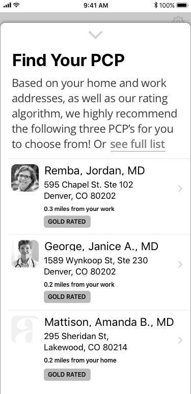
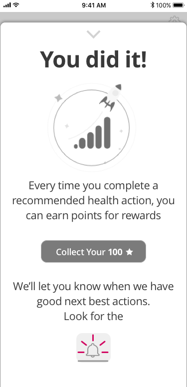
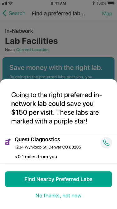
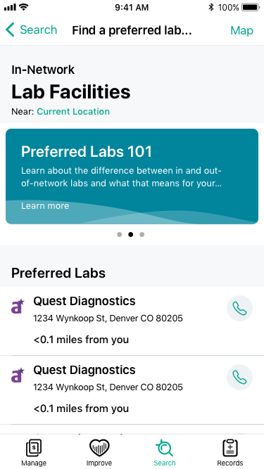
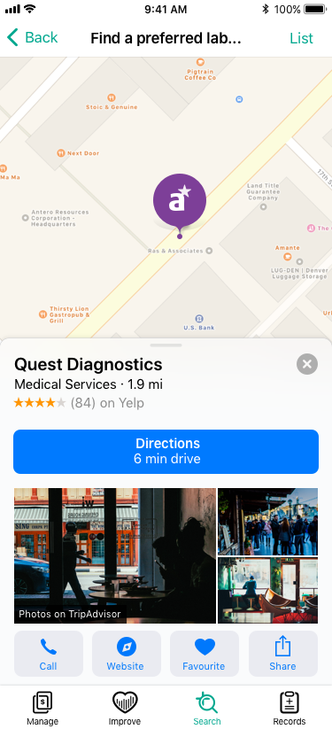
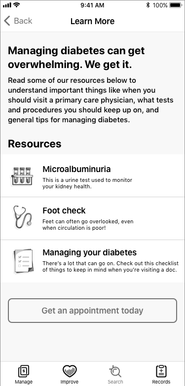
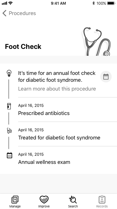
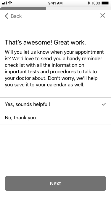
Examples of screen iterations from medium to higher fidelity


Current project status:
Initial 'Next Best Actions' have been built and released on Tuesday, May 15th
MEASUREMENT: Behavior Change Rates
The goal with this campaign was to get people to visit their PCP. We’re measuring this based on real claims data, so we know if people are actually going to the doctor or not. For each cohort we measure this against a control group of members who fit the exact same criteria as those in the campaign but that we held out so we could see how impactful our NBA campaign is. We also use the raw numbers to determine how “statistically significant” our results are, which basically just means how confident we are that we impacted the change and that it wasn’t just random noise. Here’s how it’s going so far:
Cohort A – We know who your PCP is
Increase in doctor visits: 158%
Significance: 87%
Cohort B – We don’t know who your PCP is
Increase in doctor visits: 215%
Significance: 94%
Cohort C – You’re newer to Aetna
Increase in doctor visits: -16%
Significance: 68%
Design team is working on fleshing out the UX Flows and initial wireframes for the next several 'Next Best Actions', while building a template library and process to make this scalable and sustainable
I am also currently working with product, architects, and engineers to build out the Recommendation Engine that will consume and prioritize all the list of personalized actions the app will provide for each user